1 - Naming of effects
In some cases, it's not clear what the effect does until you try it. The naming of the effects might be improved to make things clearer:
Black&White --> "Black on White"
White&Black --> "White on Black"
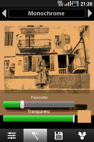
Mono --> Dye (From what I can see the chosen colour is applied on the image).
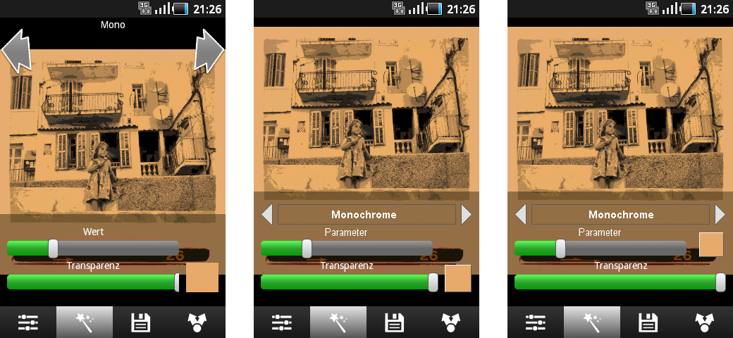
2 - UI: Space consuming layout
The layout of the user interface could be improved. The two buttons at the top consume a lot of space and in some way one has the impression that these can be used for switching between images rather than switching inbetween effects.
3 - UI:Curved buttons
The buttons for selecting an effect are very large - too large I think. Also, their shape is curved which gives and impression of a carrousel but all that the buttons are used for is selected an effect.
4 - UI: Position of effect label
The label for displaying the current effect should be centered in between the buttons, not above the buttons (consumes some extra space).
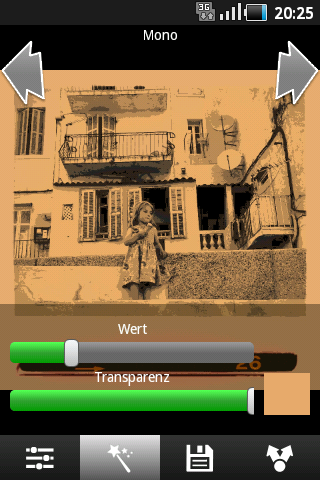
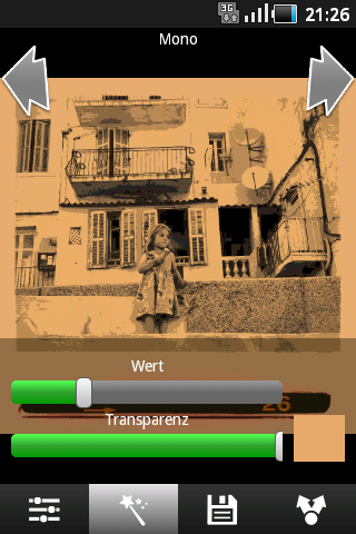
5 - "Value" slider
At the top of the screen the name of the effect is displayed, at the bottom of the screen you control the value for the effect using the "value" slider. I'd suggest to repeat the effects name at the bottom, e.g. "Pastel - Value" instead of just "Value".
6 - Sliders: Knob or Dark theme
On Android 2.2.1 the value of the slider is displayed in a bright green. If you have sliders at highest value, the bright green is disturbing. Instead, I'd suggest to have a slider with just a knob for changing the value. Alternatively, a darker, not so bright green should be used to indicated the value of the slider.
7 - Colour selection: Button style
Some of the effects (e.g. "Mono" allow for choosing a colour. The "button" for the colour is just a flat rectangle drawn in the chosen colour. If you happen to choose black you cannot even see it anymore. I'd suggest to add a frame or something to indicate that this is both a button and a indicator for the colour.
EDIT: This is what the screen looks like on a Samsung Galaxy Ace (Android 2.2.1):
This is my first experience/impression of XnSketch on a Samsung Galaxy Ace which has a comparatively small screen. Perhaps some of the issues do not occur on larger screens.
Comments and feedback is welcome.

 ___________