XnSketch 1.3: [Req] Various Suggestions

Discussions on Android and iOS apps: XnPhotoFx, XnRetro, XnSketch, and so on.

Moderators: XnTriq, helmut, xnview

User avatar
helmut
Posts: 8705
Joined: Sun Oct 12, 2003 6:47 pm
Location: Frankfurt, Germany

XnSketch 1.3: [Req] Various Suggestions

Post by helmut »

I've downloaded XnView Sketched and "played" with it for a short while. The effects and results are nice. Sure enough I've found some things that might be improved.

1 - Naming of effects
In some cases, it's not clear what the effect does until you try it. The naming of the effects might be improved to make things clearer:
Black&White --> "Black on White"
White&Black --> "White on Black"
Mono --> Dye (From what I can see the chosen colour is applied on the image).


2 - UI: Space consuming layout
The layout of the user interface could be improved. The two buttons at the top consume a lot of space and in some way one has the impression that these can be used for switching between images rather than switching inbetween effects.

3 - UI:Curved buttons
The buttons for selecting an effect are very large - too large I think. Also, their shape is curved which gives and impression of a carrousel but all that the buttons are used for is selected an effect.

4 - UI: Position of effect label
The label for displaying the current effect should be centered in between the buttons, not above the buttons (consumes some extra space).

5 - "Value" slider
At the top of the screen the name of the effect is displayed, at the bottom of the screen you control the value for the effect using the "value" slider. I'd suggest to repeat the effects name at the bottom, e.g. "Pastel - Value" instead of just "Value".

6 - Sliders: Knob or Dark theme
On Android 2.2.1 the value of the slider is displayed in a bright green. If you have sliders at highest value, the bright green is disturbing. Instead, I'd suggest to have a slider with just a knob for changing the value. Alternatively, a darker, not so bright green should be used to indicated the value of the slider.

7 - Colour selection: Button style
Some of the effects (e.g. "Mono" allow for choosing a colour. The "button" for the colour is just a flat rectangle drawn in the chosen colour. If you happen to choose black you cannot even see it anymore. I'd suggest to add a frame or something to indicate that this is both a button and a indicator for the colour.

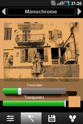
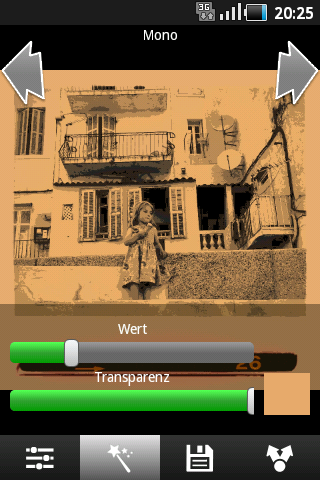
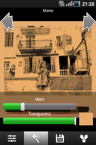
EDIT: This is what the screen looks like on a Samsung Galaxy Ace (Android 2.2.1):
Image


This is my first experience/impression of XnSketch on a Samsung Galaxy Ace which has a comparatively small screen. Perhaps some of the issues do not occur on larger screens.

Comments and feedback is welcome.
User avatar
xnview
Author of XnView
Posts: 44575
Joined: Mon Oct 13, 2003 7:31 am
Location: France

Re: XnSketch 1.2: [Req] Various Suggestions

Post by xnview »

helmut wrote: 2 - UI: Space consuming layout
The layout of the user interface could be improved. The two buttons at the top consume a lot of space and in some way one has the impression that these can be used for switching between images rather than switching inbetween effects.
So you think that arrows must be smaller?
3 - UI:Curved buttons
The buttons for selecting an effect are very large - too large I think. Also, their shape is curved which gives and impression of a carrousel but all that the buttons are used for is selected an effect.
curves???
4 - UI: Position of effect label
The label for displaying the current effect should be centered in between the buttons, not above the buttons (consumes some extra space).
But the label on the top is centered already
5 - "Value" slider
At the top of the screen the name of the effect is displayed, at the bottom of the screen you control the value for the effect using the "value" slider. I'd suggest to repeat the effects name at the bottom, e.g. "Pastel - Value" instead of just "Value".
You would like to change 'Amount' label with effect label?
6 - Sliders: Knob or Dark theme
On Android 2.2.1 the value of the slider is displayed in a bright green. If you have sliders at highest value, the bright green is disturbing. Instead, I'd suggest to have a slider with just a knob for changing the value. Alternatively, a darker, not so bright green should be used to indicated the value of the slider.
Hum, i don't have that on emulator
Pierre.
User avatar
helmut
Posts: 8705
Joined: Sun Oct 12, 2003 6:47 pm
Location: Frankfurt, Germany

Re: XnSketch 1.2: [Req] Various Suggestions

Post by helmut »

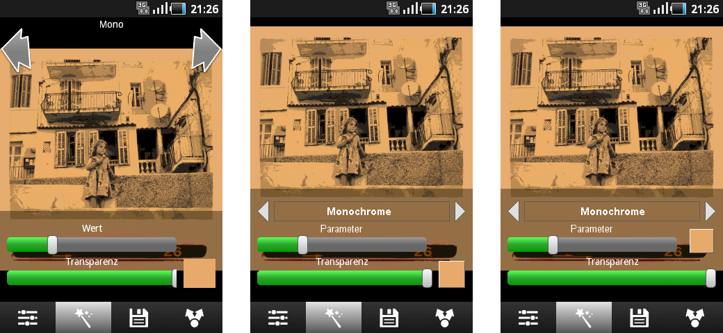
I've designed a draft to show what I mean and what XnSketch might look like:

Original and Draft
Image ___________ Image
xnview wrote:
helmut wrote: 2 - UI: Space consuming layout
The layout of the user interface could be improved. The two buttons at the top consume a lot of space and in some way one has the impression that these can be used for switching between images rather than switching inbetween effects.
So you think that arrows must be smaller?
Yes. Currently, the arrows are large whereas the text of the effect is small. This consumes space and thus the arrows don't look as if they would belong to the effect label. Above please find a draft of a more balanced "control" for choosing an effect. The font might be a bit smaller than the one I have used.
xnview wrote:
3 - UI:Curved buttons
The buttons for selecting an effect are very large - too large I think. Also, their shape is curved which gives and impression of a carrousel but all that the buttons are used for is selected an effect.
curves???
Yes, the arrows are a bit curved, see above screenshot.
xnview wrote:
4 - UI: Position of effect label
The label for displaying the current effect should be centered in between the buttons, not above the buttons (consumes some extra space).
But the label on the top is centered already
Hmm, as you can see in the above screenshot it's centered horizontally, but not centered vertically.
xnview wrote:
5 - "Value" slider
At the top of the screen the name of the effect is displayed, at the bottom of the screen you control the value for the effect using the "value" slider. I'd suggest to repeat the effects name at the bottom, e.g. "Pastel - Value" instead of just "Value".
You would like to change 'Amount' label with effect label?
Perhaps it's just the wording. 'Amount' (English) and 'Wert' (German) are not good terms. Throughout XnView the word 'Parameter' is used, I'd find this word much better. 'Parameter' or 'Effect parameter', or 'Effect strength'. But the latter are a bit long, I think.
xnview wrote:
6 - Sliders: Knob or Dark theme
On Android 2.2.1 the value of the slider is displayed in a bright green. If you have sliders at highest value, the bright green is disturbing. Instead, I'd suggest to have a slider with just a knob for changing the value. Alternatively, a darker, not so bright green should be used to indicated the value of the slider.
Hum, i don't have that on emulator
In the above screen you can see the green sliders. When working with images, it's good if the controls can be seen but do not disturb the overall impression. Currently, the sliders' green really pops out and disturbs this impression. The good thing, is that by clicking onto the images the controls dissappear. :-) I guess there is no such thing like a slider with settable colours or slider with just the thumb/knob. Perhaps a custom control?
User avatar
helmut
Posts: 8705
Joined: Sun Oct 12, 2003 6:47 pm
Location: Frankfurt, Germany

Re: XnSketch 1.5: [Req] Various Suggestions

Post by helmut »

I guess the problem of the current UI design is the split of the controls: Effects at the top and effect parameters and other stuff at the bottom. Below please find a draft with all controls at the bottom:

Original and Draft1 and Draft 2
Image

To me, the Draft 1 layout (in the middle) looks much cleaner and is probably better to control because all controls are close together. Also, the effect name and the effect parameter are close together, so it's much clearer what "Parameter" / "Value" / "Strength" does. Last not least the whole layout is more compact - more room for the image.
EDIT: And one more: XnRetro has all its controls at the bottom, too.

Please note that I've changed the rectangle for picking a colour into a smaller square and added a bevel.

Draft 2 (right):
Currently, the colour "button" is positioned at the right of the transparency slider and it looks as if it belongs to transparency, which is wrong, I think (otherwise all effects would have a colour to select). In draft 2 you see the colour "button" positions next to the effect slider. The "Next effect" button and the "Colour" button are a bit close together, this may speak against this position of the "Colour" button.
User avatar
xnview
Author of XnView
Posts: 44575
Joined: Mon Oct 13, 2003 7:31 am
Location: France

Re: XnSketch 1.2: [Req] Various Suggestions

Post by xnview »

helmut wrote:
xnview wrote:
helmut wrote: 2 - UI: Space consuming layout
The layout of the user interface could be improved. The two buttons at the top consume a lot of space and in some way one has the impression that these can be used for switching between images rather than switching inbetween effects.
So you think that arrows must be smaller?
Yes. Currently, the arrows are large whereas the text of the effect is small. This consumes space and thus the arrows don't look as if they would belong to the effect label. Above please find a draft of a more balanced "control" for choosing an effect. The font might be a bit smaller than the one I have used.
Ok
xnview wrote:
5 - "Value" slider
At the top of the screen the name of the effect is displayed, at the bottom of the screen you control the value for the effect using the "value" slider. I'd suggest to repeat the effects name at the bottom, e.g. "Pastel - Value" instead of just "Value".
You would like to change 'Amount' label with effect label?
Perhaps it's just the wording. 'Amount' (English) and 'Wert' (German) are not good terms. Throughout XnView the word 'Parameter' is used, I'd find this word much better. 'Parameter' or 'Effect parameter', or 'Effect strength'. But the latter are a bit long, I think.
Yes strength is better
xnview wrote:
6 - Sliders: Knob or Dark theme
On Android 2.2.1 the value of the slider is displayed in a bright green. If you have sliders at highest value, the bright green is disturbing. Instead, I'd suggest to have a slider with just a knob for changing the value. Alternatively, a darker, not so bright green should be used to indicated the value of the slider.
Hum, i don't have that on emulator
In the above screen you can see the green sliders. When working with images, it's good if the controls can be seen but do not disturb the overall impression. Currently, the sliders' green really pops out and disturbs this impression. The good thing, is that by clicking onto the images the controls dissappear. :-) I guess there is no such thing like a slider with settable colours or slider with just the thumb/knob. Perhaps a custom control?
Here it's your standard theme...
To me, the Draft 1 layout (in the middle) looks much cleaner and is probably better to control because all controls are close together. Also, the effect name and the effect parameter are close together, so it's much clearer what "Parameter" / "Value" / "Strength" does. Last not least the whole layout is more compact - more room for the image.
But the problem if you put arrow/label on the bottom, is that image view is more hidden (more when you have landscape image).
Draft 2 (right):
Currently, the colour "button" is positioned at the right of the transparency slider and it looks as if it belongs to transparency, which is wrong, I think (otherwise all effects would have a colour to select). In draft 2 you see the colour "button" positions next to the effect slider. The "Next effect" button and the "Colour" button are a bit close together, this may speak against this position of the "Colour" button.
No draft2?? :)
Pierre.
User avatar
helmut
Posts: 8705
Joined: Sun Oct 12, 2003 6:47 pm
Location: Frankfurt, Germany

Re: XnSketch 1.2: [Req] Various Suggestions

Post by helmut »

Thanks for your replies, Pierre.

5 - "Value" slider
xnview wrote:Yes strength is better
Hmm, I'd prefer "Parameter" because this term is used throughout XnView.

6 - Sliders: Knob or Dark theme
xnview wrote:Here it's your standard theme...
I guess this standard theme can be changed, right?
xnview wrote:
helmut wrote:To me, the Draft 1 layout (in the middle) looks much cleaner ...
But the problem if you put arrow/label on the bottom, is that image view is more hidden (more when you have landscape image).
Hmm, I don't quite understand: At the moment, effect selection controls are at the top and consume a specific height. When moving the controls to the bottom, the whole image might move to the top and as you can see in my draft even more space is available for displaying the image.
xnview wrote:
helmut wrote:Draft 2 (right): ..
No draft2?? :)
Above, there is original on the left, draft 1 in the middle and draft 2 one the right.
User avatar
xnview
Author of XnView
Posts: 44575
Joined: Mon Oct 13, 2003 7:31 am
Location: France

Re: XnSketch 1.2: [Req] Various Suggestions

Post by xnview »

helmut wrote:Thanks for your replies, Pierre.

5 - "Value" slider
xnview wrote:Yes strength is better
Hmm, I'd prefer "Parameter" because this term is used throughout XnView.
Really, 'strength' or 'Amount' is better for this effect, parameter is global. Transparency is a parameter...
6 - Sliders: Knob or Dark theme
xnview wrote:Here it's your standard theme...
I guess this standard theme can be changed, right?
Not directly...
xnview wrote:
helmut wrote:To me, the Draft 1 layout (in the middle) looks much cleaner ...
But the problem if you put arrow/label on the bottom, is that image view is more hidden (more when you have landscape image).
Hmm, I don't quite understand: At the moment, effect selection controls are at the top and consume a specific height. When moving the controls to the bottom, the whole image might move to the top and as you can see in my draft even more space is available for displaying the image.
Not for a landscape image...
xnview wrote:
helmut wrote:Draft 2 (right): ..
No draft2?? :)
Above, there is original on the left, draft 1 in the middle and draft 2 one the right.
now there is a draft2, strange :)
Pierre.
User avatar
helmut
Posts: 8705
Joined: Sun Oct 12, 2003 6:47 pm
Location: Frankfurt, Germany

Re: XnSketch 1.2: [Req] Various Suggestions

Post by helmut »

xnview wrote:[5 - "Value" slider
Really, 'strength' or 'Amount' is better for this effect, parameter is global. Transparency is a parameter...
O.k., agreed. (When placing the effect selection on the bottom there's another alternative option: There could be no label for the slider at all, since the slider directly belongs to the selected effect.)

6 - Sliders: Knob or Dark theme
O.k.. Looks like you need some extra tools/apps to change the standard theme.
xnview wrote:...Not for a landscape image...
I still don't understand: Currently, the controls are at the bottom and at the top and space consuming, image is in the middle. My suggestion is, to move all controls to the bottom of the screen and make them smaller. Image would move a little towards the top. Why should there be LESS space available for an image (be it portrait or landscape)???
xnview wrote:... now there is a draft2, strange :)
Perhaps a problem with the browser cache. Or your browser was not maximaized. Or... ;-) Again the above screenshots:

Original and Draft1 and Draft 2
Image
User avatar
XnTriq
Moderator & Librarian
Posts: 6374
Joined: Sun Sep 25, 2005 3:00 am
Location: Ref Desk

Re: XnSketch 1.2: [Req] Various Suggestions

Post by XnTriq »

xnview wrote:
helmut wrote:Thanks for your replies, Pierre.

5 - "Value" slider
xnview wrote:Yes strength is better
Hmm, I'd prefer "Parameter" because this term is used throughout XnView.
Really, 'strength' or 'Amount' is better for this effect, parameter is global. Transparency is a parameter...
How about “intensity”?
User avatar
helmut
Posts: 8705
Joined: Sun Oct 12, 2003 6:47 pm
Location: Frankfurt, Germany

Re: XnSketch 1.2: [Req] Various Suggestions

Post by helmut »

XnTriq wrote:How about “intensity”?
I'm not a native speaker, but "intensity" sounds very good to me.
User avatar
schultzter
Posts: 27
Joined: Tue Aug 26, 2014 4:38 pm
Location: Montreal, Qc

Re: XnSketch 1.3: [Req] Various Suggestions

Post by schultzter »

Good afternoon...

I have another suggestion. I just stumbled upon XnSketch and XnRetro while looking for a good desktop photo organizer (like XnViewMP). I like them both, but I notice XnRetro let's me start by cropping the photo but XnSketch does not. I really like square photos for when I'm social-sharing. I know that's subjective but that's what I like.

I would suggest to add the same feature to XnSketch so I can make my image square before I start to apply effects.

Thanks,
Version 0.72 x64 (Dec 19 2014) on Arch Linux

Headed for the second star to the right and straight on 'til morning...